
Bloom x
Be Odd
Bloom x Be Odd
BeOdd Challenged Every Norm, And We Loved It. Each Touchpoint Was A Creative Playground Where The Only Rule Was: Don’t Be Boring.
Branding
We kept it simple, but bold. The logo isn’t just a name—it’s a little reminder to not follow the herd. The lowercase “be odd.” in a clean font reflects exactly what they stand for: not trying too hard, but still standing out. It sits confidently on everything they do, quietly rebellious.
Packaging
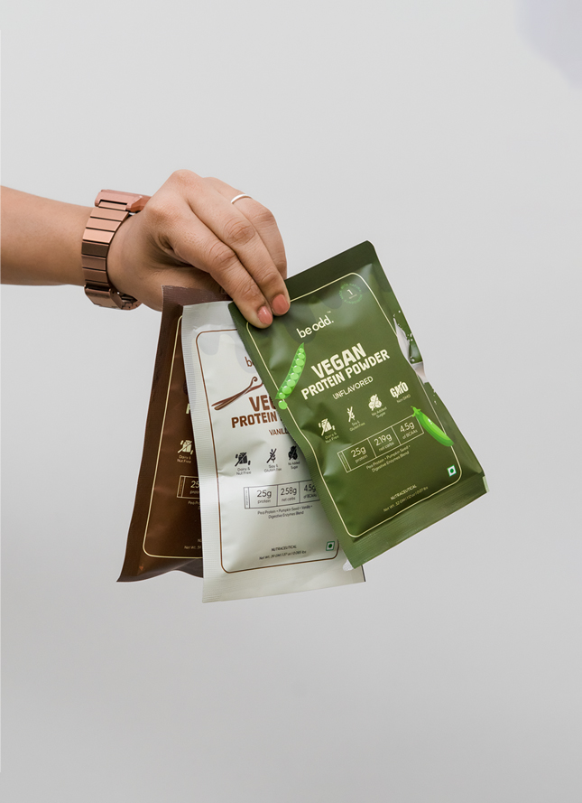
We used unexpected color combos and kept the design minimal, letting the brand’s personality come through without shouting. No greens, no leafy textures, none of the usual cues other “all-natural” brands go for. It feels premium, feels different, and definitely doesn’t look like everything else on the shelf.
Social Media
When we were out on the streets, shooting videos and taking photos for their social media, we picked the oddest spots, worked with the quirkiest people, and stayed committed to one goal: delivering their vision of 'odd' in every frame. And it’s doing well—real people connecting with real moments.
Performance Marketing
We kept it sharp, creative, and on-brand. The ads stood out because they didn’t look like ads. With scroll-stopping visuals and messaging that didn’t try too hard, performance has been strong. People are curious, they click, and they stay. That’s a win.
E-Commerce
Their online store is growing bit by bit, and it’s solid. We built a clean, easy-to-navigate experience that feels like BeOdd: simple, but unexpected. Research backed keywords to drive the right people to their products. The product + experience combo is working.
Website Development
We wanted the website to feel like the brand—odd in the best way. The layout isn’t your typical wellness site. It’s got personality. It's got flow. And most importantly, it’s got real people, real research, and real results—that’s exactly what we’re showing on the site. It draws people in without trying too hard. Basically, it does exactly what BeOdd set out to do.
Conclusion
This project was about more than ticking off services. It was about building a brand that’s not afraid to be itself. From the logo to the last line of copy, everything had to feel a little different—just like BeOdd. And we’re glad we could help them keep it that way.
More Projects